The new Motorway
- Harry Jones
- 21st May 2019
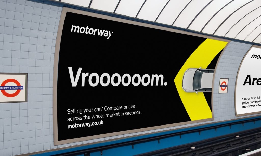
Today we’re excited to announce a brand new look for Motorway.
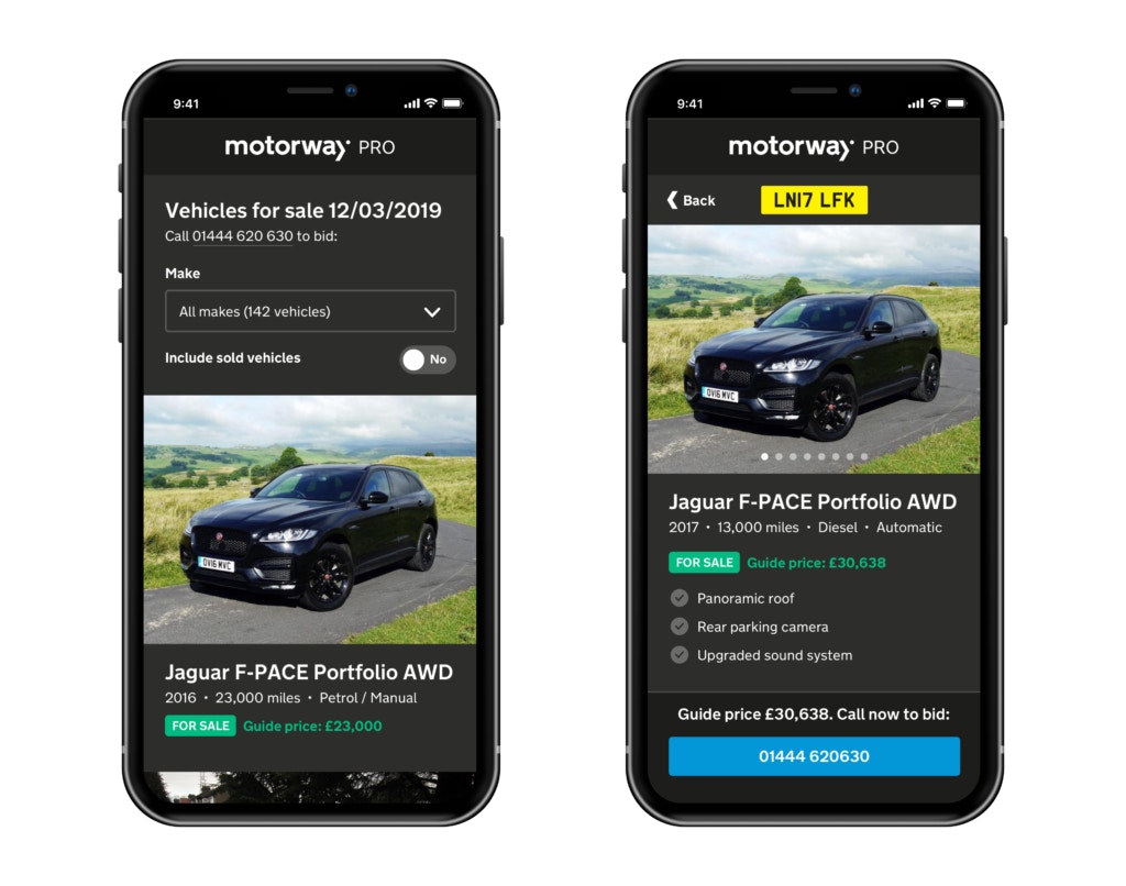
Our new brand includes a fresh, bold redesign of our website and a brand new logo, colour palette and typographic design.


Motorway has grown significantly since launching in 2017, and we now help thousands of customers compare offers for their car every day. For hundreds of professional car buyers we are now a major source of exclusive vehicle stock.
Our new brand reflects this growth and leadership in car selling with a confident and forward-thinking look.
The new design was developed in collaboration with Koto and is inspired by the iconic and enduring UK road signage system designed by Jock Kinneir and Margaret Calvert, first introduced in 1958 as the signage for the UK’s first motorway.


This signage system was groundbreaking in completely rejecting and replacing all road signs that came before, bringing with it a clarity and simplicity that had never been seen before by British motorists. It’s this futuristic, pioneering spirit that we hope to embody at Motorway as we seek to revolutionise the way we buy and sell cars.


In creating the Motorway identity, Koto took the Transport font used on road signs and elements such as the chevron, combining them with a modern, digital colour palette, photography and illustration.

Our in-house design team then developed these concepts and guidelines into a design system and component library that is now used across all of Motorway’s products.


We’re really proud of our new look, and would like to thank James, Tim, Tom, Courtney, Craig and the whole team at Koto that worked on this project with us.